With 500 million daily users, you definitely need an edge to stand out in the world of Instagram. Using the best profile templates is the first step towards creating an impressive profile that makes people click on the follow button.
The competition has never been tougher when it comes to social media. Instagram is more than just a social media page these days. Whether as an individual or a business, it is one of the most acclaimed platforms to grow brands and market oneself.
At this point, it is necessary to make one thing clear. Creating an impression on any social media is not that easy, especially when there are dozens or even hundreds of others who are doing the same. Not only do the posts have to be incredible, but they also need to be unique.
So how to actually create something like that without having to invest a consuming amount of time? Enter the fabulous profile templates, that makes the whole process effortless and adds aesthetics.

What and Why
Before pondering on other points, let us start with what exactly are profile templates and why one should use it. A gallery with different modes and colors are never pleasing for any viewer. Today an Instagram gallery works similar to how a website reflects the brand value. The visuals have to be individual and the content has to be incredible. Not just for brands, any individual can use it to make a unique identity on the platform.
All it takes is a few seconds for a user to slide through the gallery and decide whether they want to follow. About 60% of the popular brands use the same filter and layouts throughout the gallery that gives them a uniformity.
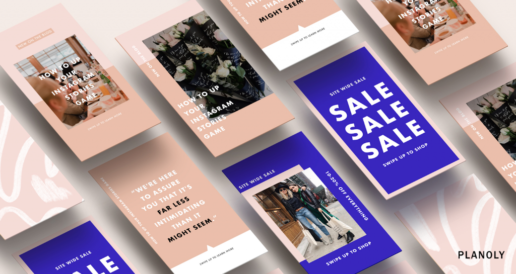
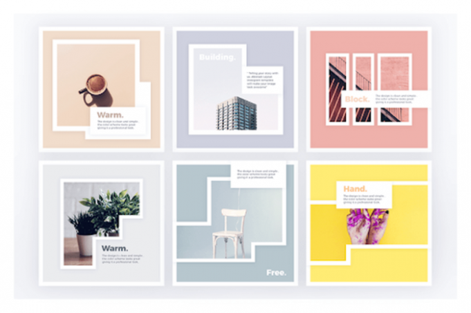
Instagram templates are pre-made layouts that allow the user to edit the content but keep a consistent style for all the posts. These bring in uniformity to the profile to add in a unique aesthetic element to the gallery. Such a design has different features like color pallets, graphics, texts, fillers and creates uniformity that creates a visual theme that resonates with the target audience.
But the main benefit of using these pre-designed themes is to save time. Unlike a brand with a dedicated marketing team, the majority of users falling in the category of young students might not have the affordability of finances or time. Especially while tackling with the college work, sitting and developing an Instagram layout would be the last thing they want to do. Nevertheless, just like quick fixes for profiles, students can also seek the help of professional essay writers to save time on crafting essays or other academic papers. For help on that, you can check EssayPro.com to get more information. The website can not only offer writing services but also can guide students with useful tips.
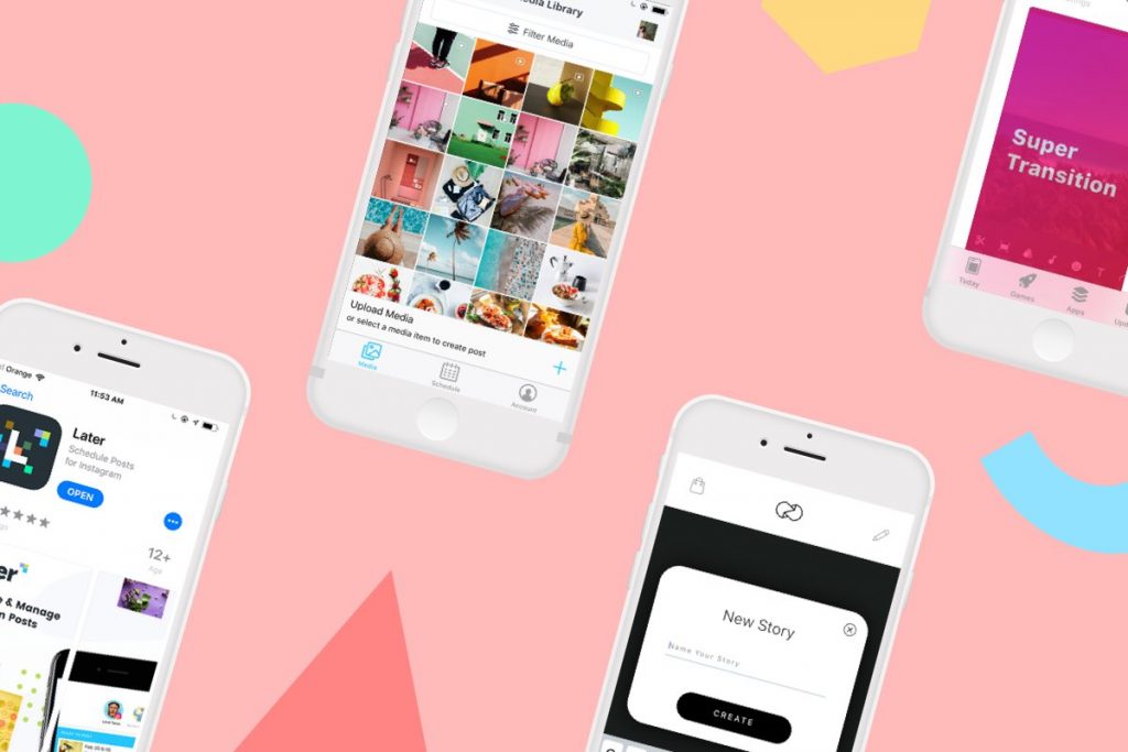
Like making a quick college presentation with existing templates on a Powerpoint model, Instagram can also be more fun and productive with the right tools to help along the posting process. Now that we have covered why to use these layouts, let us see how to choose the right one for your gallery? Here is all the information that one needs to remember while using an Instagram profile template.

1. Trends and Specs
A quick Google search can present a myriad of options for free and paid versions of these layouts. Before blindly choosing one just based on how it looks to the eyes, make sure that the layout agrees with the current trends and practices. Many templates that are free are often outdated and does not have options to include all features of the app or is compatible with it.
Also, take a look at how much of room is there to make improvements and alterations depending on the future demands of both the application and the brand.
2. Visual Style
However good a particular design might look, it also has to reflect your particular sense of style. If it is a brand, it also has to uphold the brand value and equity. Having a unique visual theme for Instagram will make it more interesting making the audience to identify the content as well. A theme could revolve around a color palette or the filter of the posts.
It is also possible to use more than one theme that compliments the style. The theme should confer not only with the visual content but also for the texts and graphics as well.
3. Interactive Elements

Instagram is getting upgrades as we speak. The stories are gaining equal traction as a gallery post or even more. They offer more engagement with an array of interactive elements with the options of location tags, quizzes, direct messaging and many more features. Story designs should include scope to add all these elements without spoiling the color themes.
It would be smart to pick a bundle that works for both posts and stories. This can be done by checking the sizes and dimensions, as the app posts have definite sizes and the stories have different.
4. Customization
So you have found the right layout, but so have others who downloaded it. That is why it is essential that you customize the files to reflect your individual style. The templates usually come in Photoshop format. If familiar with the software, one can add personal touches by changing colors or other design elements.
Users can also develop hashtags that are unique to the account and interests. With enough engagement and other relevant hashtags, it is another way to set your posts apart.

5. Be Flexible
Last but not least, do not let your gallery stay monotonous. At times when you stick to one particular filter or style, it tends to create a pattern that makes it look like the content is not fresh. Each theme should offer flexibility to have variations or work with other color palettes to break the rut. It is possible to do this by customization or using more than one design, or a combination of both to achieve perfection.
Final Thoughts
Picking out a design right for the personality and voice of the brand could be difficult that you think. As exciting as they seem, at times it might reflect what the blog intends to speak to the audience. At the same time, the design should be enjoyable to the user and those who work with it as well. Without that aspect, it could easily turn into a monotonic page. Regardless of the size of your business or blog, using this tool is one of the simple ways to make a huge difference to your account gallery, and attract new followers to the page.


