
Branding is perhaps the most crucial process to help your business and product stand out from the rest of the competition. According to ReviewMoose, this means establishing a deep connection with the customer. If utilized correctly, it can be a highly effective method to build trust with the audience and create a unique business.
Branding is also an essential part of creating an effective marketing strategy to increase product awareness. There has to be a core value behind the brand that the business should maintain and present to the public to attract new customers and keep the current ones satisfied.
A brand is not just the name of the company or the product. It’s the voice and tone in which the organization speaks to its consumers. However, besides these attributes, there’s another essential aspect of branding that can profoundly affect the customer base—color!
Color is an essential part of the brand, as it appears on the logo, the official website, e-commerce, storefronts, and product labels. The color scheme plays a significant role in building a recognizable brand across all channels.
How Do People Respond to Colors?
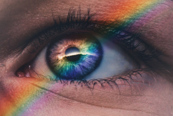
According to color psychology, certain hues can awaken different emotions in people. The color scheme of your product is the first thing people will notice. In fact, stats from Colorcom reveal that 84.7% of people agree that color plays an essential role in their purchasing decision.
Colors can be divided into two main categories. Warm hues are usually associated with energy, and cool ones promote calmness and security. Still, there’s a deeper meaning for each shade that can genuinely entice new customers when paired with the correct logo design.
Colors and Emotions
Even though people react in various ways, each color has something specific about it that will provoke a particular emotion.
1. Red Is Energetic

Red is a powerful color that raises the heart rate and increases energy. It’s associated with passion and is undoubtedly an attention-grabbing color. Depending on its use, it can be provocative or excitable. Some hues of red can also increase hunger, and that’s why you’ll see it at fast food businesses like KFC and McDonald’s.
2. Orange Is Happy
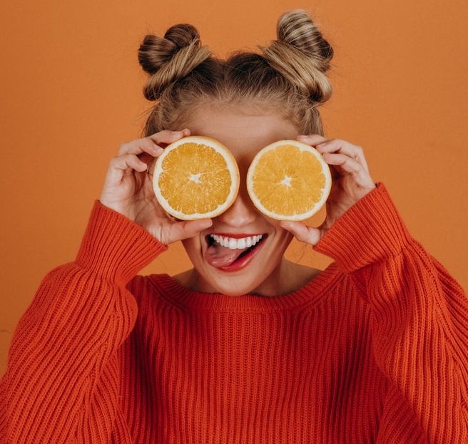
Orange is used to promote happiness. It’s cheerful, playful, and bold. Orange is also friendly and is an excellent selection for brands that want to combine the optimism of yellow and the energy of red. Fanta is an ideal example of the proper use of orange.
3. Yellow Is Optimistic

Yellow is associated with summer and sun and is a bright, creative, and cheerful color. At the same time, yellow is the first color that the human eye notices. Unfortunately, yellow is also many people’s least favorite color. That’s why it’s wise to combine hues of yellow accents with another primary color, as UPS and Ikea do.
4. Green Is Calming

Green wakes up the feelings of freshness, calms people down, and is the most pleasant color to the human eye. Besides serenity, green emotes feelings of prestige, safety, and generosity. Furthermore, light green can reflect health, and darker shades can signal prestige. Starbucks and Lacoste are the best examples of brands that utilize the color green.
5. Blue Is Safe

Blue is a classic color used by many businesses across the globe. It’s associated with loyalty, security, and trust. It also conveys strength and dependability, and that’s why PayPal and American Express include it in their logos. Blue is also a favorite color of both men and women.
6. Purple Is Sophisticated

Often associated with royalty, purple is a color of elegance and sophistication. Purple has a mysterious element to it, but it’s also connected to wisdom. Lighter shades have more feminine energy, and bright purple leans towards power. Hallmark and Cadbury are perfect examples.
7. Brown Is Reliable

Brown is a natural color that reminds people of durability and reliability. It’s great for brands that want to portray strength and reliability. Still, it’s a dark hue that could be associated with negative feelings, so you should be careful how you use it. UPS and Hershey’s have stylishly branded themselves using this rich earth tone.
8. Black and White as Contrasts

Although black and white are not technically colors, that shouldn’t prevent you from using them. White and black are suitable for creating a contrast. Black is luxurious and sophisticated, while white is associated with purity and cleanliness. When deciding on a black and white combination, think of Chanel or Nike.
How to Select the Right Color for a Brand?

To properly select the correct color palette, start by establishing your brand identity. Think about how you want your brand to be perceived and what will make it stand out among the competition. Make sure to consider your industry and analyze which colors other businesses are using in their branding. Try to learn from how and why they chose their color schemes.
Hopefully, the suggestions above will give you an overall idea of which colors you should use. Keep in mind that a person’s reaction to color is totally arbitrary and primarily dependent on cultural differences, upbringing, and life experiences. These unique traits won’t make the color selection easy for you.
However, you can still overcome this issue by creating a well-thought-out color palette for your business. If you’re in the food industry, you’ll want to use colors that increase the appetite, like red and yellow. If your business is related to health and wellness, you can choose blue for peace or green for wholesomeness.
If you feel stuck, test out your ideas with the online color palette generators. Start by selecting your primary color and then consider which color scheme you want:
- Analogous color schemes are harmonious and pleasant
- Monochromatic color schemes enhance your primary color
- Contrasting color schemes give off a fun and modern vibe
Final Word
Your brand is the essence of your business. It’s visible on all your social media, websites, apps, logos, and storefronts. When thinking about your brand, consider how you would like to interact with your customers. You need to know that color is crucial in getting your message directly to your target audience.
Each color can evoke a specific emotion. Even though that feeling is closely related to the person’s background, you can still positively affect that individual with the correct use of color in your branding.
When selecting a color, think about some of your favorite brands and how their color palette affects you. Consider which color scheme you want to use and which feelings you want to elicit from your clientele. Once you’ve selected the right colors that match the voice, tone, and vibe of your business, you’ll be on your way to creating a lasting brand.


