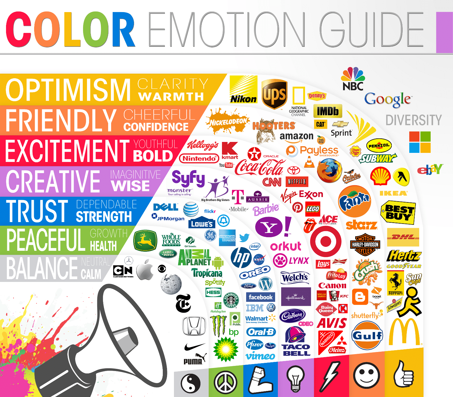
The perfectly-made logo speaks everything about your business. The right color choice is a must to depict the real meaning of your business sign. It should look appealing and attractive to your audience. One must understand simple color psychology before designing the business logo.
You can influence your audience and connect them with your company through colors. One can determine the correct color scheme by examining different logo signs for businesses. It is important to be creative and unique at the same time. The sign must look professional and describe your brand details.
This write-up lets you determine the color theory reputed brands use. You must opt for it and select the appropriate color for designing your company logo. When you know the meaning of every color, you easily design a high-quality professional business sign.
Meanings of Different Colors
1. Red
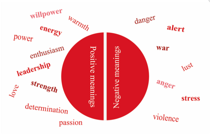
You can instantly choose the warmest red to get everyone’s attention instantly. It is a perfect masculine extrovert color, which is quite intense, like fire or blood. It tells about passion, determination, and extreme desire for anything. You can observe red flags.
Red symbolizes appetite, excitement, passion, better metabolism, and respiration. Many buttons, like Purchase or add to cart, are also in red. It helps in gaining the attention of every visitor quickly. If you are designing a logo for companies, such as food or entertainment, then it is good to pick red.
2. Yellow
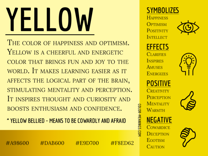
It is a bright, vibrant color that means sunshine. You can use yellow to give meaning to your logo, i.e., cheerful, enhanced mental activity, energetic, etc. You can get the same attention you get with red, but it is good if you use it sparingly.
If you use it sparingly, it can make people distracted. Sometimes, it gives negative impacts like fear, losing self-confidence, isolation, etc. Therefore, it is mandatory to use it within the limit. Generally, it is used for food and automation industries.
3. Blue
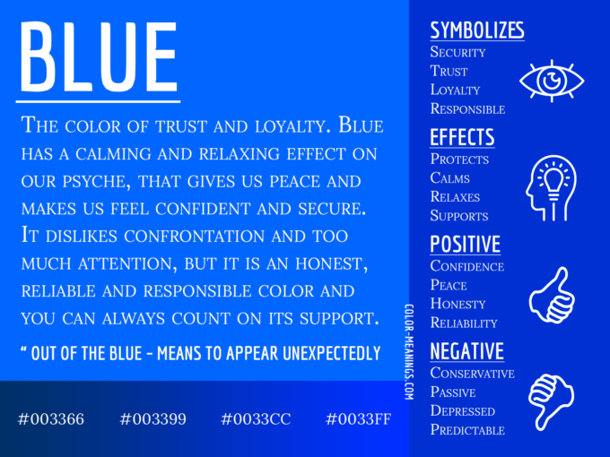
If your brand logo relates to the banking sector, pharmaceuticals, applications, etc., you can pick blue for the design. It appears refreshing and inspires people to seek knowledge. Add red and blue if you want to show confidence through the sign.
You can consider this soothing blue for different psychological traits, like imagination, freedom, immense peace, intelligence, loyalty, confidence, etc. Overuse of this blue can make your logo dramatic and impact negatively.
The purpose of your logo is to bind people with your brand value and not force them to do anything. Your business is helpful to others, and the same emotion must appear in your sign.
4. Green
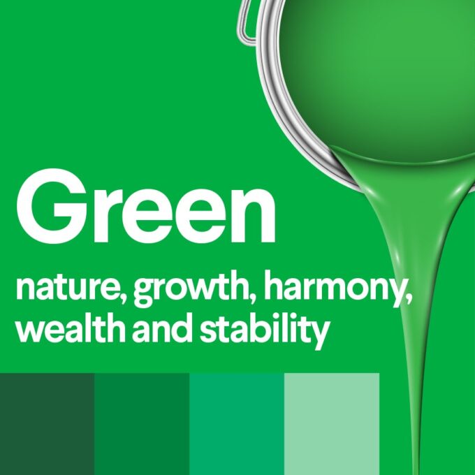
This color depicts greenery and relates to the environment. You can target green if your business supports environmental factors like agriculture, natural energy sources, etc. It is another soothing color, i.e., good for your mind’s peace.
Green means safety, wealth, life, spring, etc. If you want to symbolize growth, you can use green. It is good to consider green to set the background color and gain the attention of everyone immediately.
5. Purple
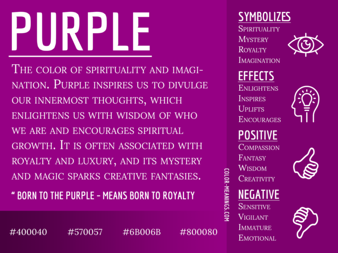
This amazing purple is a mix of blue and red, which simultaneously means soothing and energy. Adding purple to your company logo will give it special meaning, like passion, self-confidence, luxury, power, ambition, etc.
Purple is an elegant color that can be used for feminine brands. It is okay if your company is focused on glam products. You will feel sophisticated if you use purple in your business sign. You can combine it with others to add more meaning to it.
6. Black
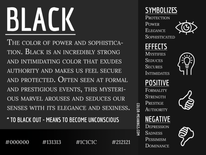
It is a mysterious color that can absorb all other colors. It represents shadow, strength, elegance, emptiness, etc. You can use it if you are running any corporate business. It looks prestigious and allows everyone to get confidence.
To symbolize power, you can use black but ensure not to give any negative feeling. The sign must be simple so that it appears elegant and not negative. Keeping all the positive as well as negative factors of black, you need to add it to the logo.
7. Brown
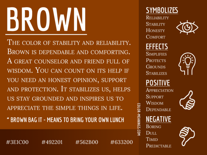
Adding brown to your company sign represents a sense of trust, unity, and reliability. It is earthy that connects with nature. If you pick brown, you can feel relaxation, purity, cleanliness, etc.
You can use this environment-friendly color like green but never mix its emotions with other colors. You can combine it with other colors to provide additional meaning.
8. White
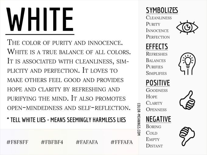
It is better to keep the logo design simple and sophisticated. One can add white to make it clean and purify its meaning. Simple sign designs are quite trending, and many companies opt for them.
You can combine it with other colors or use it completely if the website background is dark. But remember that white means cool tone and must be used wherever required.
9. Orange
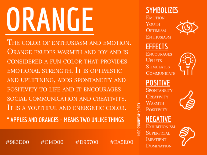
It is an amazing mixture of red and yellow colors, which appears sour. It means joy, a high level of creativity, passion, autumn, happiness, warmth, etc. It can also be related to hunger, disappointments, heartbreaks, etc.
If you use orange, it will appear quite prominent as it is highly visible. As per your activities, you can use orange, but you must not overuse it.
How to Select the Perfect Color While Designing Your Company Logo?
Depending on your brand personality, you must pick colors appropriately. You must check various factors for better choices. Such as:
- Tone: Serious or Fun
- Gender: Male or Female
- Age: Old or Young
- Time: Ancient or modern
- Value: Reasonable or Luxurious
- Energy: Subtle or Loud
When you decide on these factors, you can pick the color palette for designing your logo.
Final Thoughts
Each color has significance as it gives different meanings to your company logo. You must understand the theory and be careful while putting any color on the sign. Your brand reputation depends on the sign design, and it needs to be done with care and enough knowledge.

