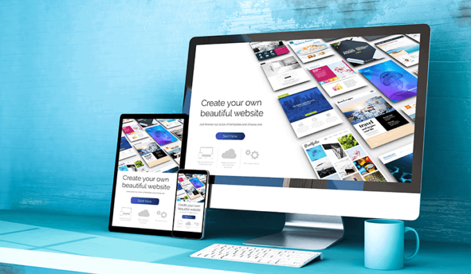
Are you a site or a brand owner, trying to make something catchy, modern, and appealing when it comes to your brand or your site? Well, DIY website builders are a way for regular people to design and build their own websites without using code or without having to know all the fancy and techy rules. Who says that you have got to have a college degree in mastering websites? If you wish to know what are some dos and don’ts of using DIY website builders keep on reading and find your answers down below.
What is a website builder?
A DIY website builder is a way of doing a website yourself and without paying or booking a professional. Years back sites had to be manually written using HTML, which nowadays would seem pretty tough to do without years of training. Nowadays, you don’t have to start from scratch and you don’t have to spend months and months learning to code. You can choose from pre-made website builders that are flexible and easy to use by going for a template that is the best fit for your brand/aesthetic. Simply log in to the site and navigate it from there. You can find a lot of online DIY site builders at pretty affordable rates, but more on that later in the article.
Who should use a website builder?
This is for anyone who wants to get started with their personal expression or a business of some sort. This means that both amateurs and professionals can use them with ease. Since you get to choose among a ton of different options and templates you will also probably and easily find a section that works well for you. In the end, if you are on a budget of some sort you should consider giving it a go on your own. This way you will save a ton of money yet have fun personalizing the site and adjusting it however you like.
Top 3 dos of using a DIY website builder
1. Choose a responsive design template
Finding the perfect design template means catering the look and thinking about your audience every step of the way. With a lot more phone & tablet users, nowadays your approach must be diverse, and not only computer-operational. Can your site be viewed with any phone and software? You don’t have to make a separate version of your website for mobile and desktop, but you should go for a template that has a dual purpose.
PS: While you are at it make sure that your chosen text & format is clear. Go for a neat, clean & spaced-out design for a better experience for all of your readers. Additionally, adding a multi language website feature can give you advantages over others.
2. Design a site with your CTA in mind

CTA stands for calls to action, which is what helps your visitors navigate the site and figure out what they want to do while on it. Do they want to react and get in touch with you immediately, or are they there just to browse through? Make sure that your CTA is straightforward and clear, no reason to use several of them at once (it might confuse the reader). When working on it and when designing it, leave out a ton of white space around each CTA on your page. This CTA can be an example of ”buy now”, ”download now” or ”get in touch”. You can customize however you like.
3. Do go for a consistent design
Who you are as a brand or as an individual has a lot to do with the site and your appearance. This is why you should keep the same template, format, fonts, and pictures throughout the site. Make sure that your home page, about us page, and product or service page look the same. Aim for the same aesthetic & pictures, never overdo it or make it look tacky. The site and your approach should reflect you as a brand, leaving others aware of your style from the get-go. Although it may come across as a time-consuming job, it is one worth doing and investing a ton of your time in if you are serious about your intentions.
Top 2 dont’s of using a DIY website builder
1. Stay away from complicated sites
How good is your navigation in general and in real life? Do you know how to make a site appropriate and appealing? Website navigation affects how easy it is for your visitors to get from point A to point B, which is why you have to opt for a simpler route. Although some templates and designs may look appealing and chic, think twice before going for them because of their template and ease of use. Some of your audience might not be as tech-savvy.
2. Page speed
Years back and when dealing with dial-up connections people had it 10x rougher and slower with their sites. Luckily, those days are over and are behind us, which is why you as a site developer should make sure that’s how it stays. It takes only 2.4 seconds for a visitor to lose his or her interest in your site if it takes too long to load or if it is slow. So, don’t sit around and let it fall apart. Work on perfecting it day after day.
How to create a website on your own?

Does this sound appealing, easy, and fun to you? If that is the case you should click here and browse through your options! With this site, every user can get flawless templates and will have a site that requires no coding whatsoever! It is easy to use and edit + you can choose between three different types of domains: a website, business, or advanced store, all of which are affordable yet ideal for your use. Give them a click and see their professionalism yet ease of use, perfect for newbies or experts.


